Last updated by at .

Categories
business transformation digital transformation organizational strategy technology video clip

online mobile in offline and why it’s wrong

Margot Langsdorf from PSFK on Vimeo.

A good reminder of a few things. There’s not offline and online. Connectivity is simply a new dimension and mobile is hence about mobility. Which means there’s confusion to be experienced when/if working on mobile strategy and digital strategy and social strategy. Maybe it’s best to just talk about strategic planning and thinking for being real world ready…

The holistic approach to digital strategy is simply about the real world

In the article Why Nordstrom’s Digital Strategy Works (and Yours Probably Doesn’t), from Harvard Business Review, the three authors (from MIT Sloan School of Management, MIT Sloan’s Center for Information Systems Research and University of Texas at Austin) stress the fact that although a great number of respondents (in their research) expect competitive advantage from SMACIT technologies (Social, Mobile, Analytics, Cloud, IoT) – it’s unlikely to happen. Those technologies are rather minimum requirements, and highly available to boot.

The trick lies in how you combine, deploy and use them. Yes, that’s when you add a strategy behind it all. But as is often the case with strategy – it’s mostly a word used (bantered) and rarely a concept well practiced. Reasons being lack of a true aim, a real problem to overcome, no sober discussion around strengths to focus on and weaknesses to accept, overly unrealistic expectation (feels good and looks good, but doesn’t help with crafting strategy that actually helps) etc. So it’s unlikely to happen not because it can’t happen, but because the concept of strategy is so poorly practiced.

The Nordstrom example they use highlights the difference between disparate initiatives in different parts of an organisation – masquerading as digital strategy – versus a coherent and holistic approach that realizes that a powerful digital strategy that actually accomplishes something has to take the full picture into account. Not mobile. Not social. But how everything fits together in the real world, and in real situations, with the business in the center.

This is not a matter of having the best apps, analytics, or social media tools. Instead, it’s a matter of tending to the details of building integrated digital capabilities, one at a time, making the right data accessible, and simplifying processes. Most retailers will struggle to do this because they haven’t architected their product or customer data for easy access by the new digital capabilities. Without those core capabilities, integration with and among new digital capabilities is virtually impossible.

  • building integrated…
  • data accessible
  • processes
  • easy access
  • integration

Notice how all of that has nothing to do with technology and everything to do with how people are going to work with it. And that demands understanding why it’s needed at all (what can we do better, i.e. what problem do we have today). These aspects revolve around the business, they highlight the importance of stakeholder alignment, cross departmental understanding, processes etc.

The authors sign off by suggesting that we Develop a strategy for succeeding in the digital economy—a purpose that leverages your unique capabilities and responds to market opportunities. Then grab every technology that takes you there.

And thinking about how to succeed in the digital economy is, of course, equally thinking about how to be real world ready. So if strategy is a word that sets the wrong tone and triggers the wrong associations – just make it about the real world.

Categories
creativity design video clip ways of use

The merge bike – for city people

See what happens when you think hard and prototype?! Love this bike built with city people in mind

Charger, lock contraption, retractable storage rack etc. And beautiful to boot. I want this.

Via psfk.com and made by Horse Cycles

Categories
design future nuggets technology video clip

Hardware becoming software – dimple

Is hardware becoming like software? What is that even? We often hear about hardware becoming more and more like software, meaning open source (-ish), hackable and customisable. Then, of course, focusing too much on hardware might be wrong. Either way.

This thing dimple is quite interesting as it lives somewhere in-between software and hardware and kind of transcends those boundaries. Keeping hardware intact, yet still customising it. By way of software. Hmmm. Something like that.

(if the annoying “support us now” box is in the middle of the screen, hover and click x. But do support.)

Categories
brand business case marketing video clip

Patagonia, are you asking us not to buy?

I recently bought a Patagonia jacket. Which made me think of this. Worn Wear. Not just the fact that they do in fact become stories and memories, but the reaction from a lot of people when Patagonia explicitly encourages people not to buy their clothes.

I can hear proponents of the concept of brand loyalists scream. Of sales people squirming in their chairs. But it all aligns beautifully with how brands grow, and how brands can resonate, if we think about it.

Aware Patagonia loyalists, because it’s quite likely one of the fairly few brands who actually have real loyalists. Those who go quite far to stick to Patagonia. But those people are few, and they’re most likely very environmentally conscious already.

Another thing is about the message here. It’s not so much about the message, even though it’s very clear, true, and firmly positions the brand as a true “do good brand” with a purpose beyond making quick bucks. But it’s also about how they make this public. It’s so real. There’s not an ounce of fake in here even coming from a brand. I wrote/commented a few lines on how brands publicise themselves creatively here.

And with this in mind, lets just remind ourselves that there’s always people out there, however environmentally conscious or unconscious they might be, in the market for a new jacket and pants. And those people can buy from a number of brands (except for the exceptionally small group of die hard loyalists), all of which would suit their needs. The question is about who do they come to think of first? Who resonates more?

A few of those people might take you up, reconsider, and get used clothes or maybe even repair what they have. That’s a win for Patagonia. But enough people will get something new.

So, as Byron Sharp and other myth-busting researchers have pointed out to us – go for penetration, because the potential buyers are everywhere. They’re not loyal, they’re just likely buyers, to a varying degree.

What Patagonia does isn’t risky, it’s doubly good (and they’re f***ing awesome).

Categories
design nuggets video clip what is around us

slight perspective shifts

I love this. Slight perspective shifts with dramatic manifestations. Little shift in, big shift out.

Categories
advertising brand content marketing marketing storytelling video clip

modern day brand building – advertising as a byproduct?

Welcome to Detroit from Shinola on Vimeo.

This is a nice post by Edward Boches covering Shinola, a brand I myself just recently came across flipping through Men’s Style on Flipboard (ehrm), and how well they build their brand (so far).

What’s noteworthy is that this is not about building a brand in a new way, often including opinions around the death of TV, the insanity of bought media and extinction of print. And it’s not a case of proving how traditional advertising still works. It’s about how modern brands understand it’s not either/or, it all compliments each other, and that the most powerful thing is to have a purpose, and hence story, beyond – but not irrelevant to – the commercial interest.

This isn’t about going viral or driving millions of views, rather it’s more about telling the brand story, providing easily embeddable elements, and building a library of content that doesn’t feel as disposable as most advertising.

Boches

The thing with advertising being disposable and, in general, increasingly being disliked, distrusted and enjoying less acceptance is an interesting one. It’s not just that there’s more and more bad, lazy, poorly crafted advertising speaking in a voice that’s disconnected from reality, it’s that there’s often not much of a counter weight.

Advertising, at least as we tend to narrowly define it today, should be no more than a byproduct (and certainly not the sole product) of a commercially curious creative company.

Gareth Kay

People are ad literate enough to understand how advertising works – polished by agencies, constructed and often exaggerated – but if that’s all a brand is going to serve, then screw you. If a brand opens up and shows a greater depth, signs of being in sync with society, people, vision, reality, you are much more likely to enjoy a greater acceptance to your advertising.

Think about a great brand experience you’ve had, and how that affects your perception/acceptance of their advertising. That’s brand experiences in a broader sense.

Increasingly, to get meaningfully noticed is through delivering on the unexpected and over-delivering on the expected. Not very advertising centred, but very much commercial creativity.

Categories
future internet technology video clip what is around us

ICAs framtida vision en underskattning av tekniken

ICA delar i en film med sig hur de ser framtiden. En framtid de, antar jag, gärna ser och bidrar till. En otroligt krävande, påträngande och underskattande om du frågar mig.

När dina ägg är slut ska du inte bara tala om detta för en liten manick, utan följa upp denna upplysning med en beställning på nya. Kanske även antalet. Det funkar ju, men det är ungefär som de där människorna (ni vet vilka) som talar om att de ska maila, drar iväg mailet, för att 2 minuter senare dyka upp (fysiskt eller i SMS) och tala om att de har mailat. De utnyttjar liksom inte styrkan i tekniken (jo, jag talar om mail som teknik). Predictive technology ska ju ta handlar om just detta, exempelvis google now.

Inköpslistan som skapas av alla dessa krävande inmatningar i ett system (som under de första åren inte kommer vara optimalt utan en orsak till extrem frustration fattar man ju), pushas sedan ut till en stackars familjemedlem (eller slav, det förtäljer inte historien). Snacka om oväsentligt, påträngande strunt. Stackare.

Ska framtiden verkligen behöva vara så krävande?

Nä, så här kommer det inte se ut. Varför? För det första för att det är inte bra, och för det andra för att vi redan har teknik som gör detta på ett bättre sätt.

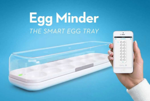
Egg minder by GE and Quirky
GE har, tillsammans med Quirky, som sysslar med produktutveckling (ofta en “framåtlutad teknisk inställning”) med crowdsourcing som metod, tagit fram en lösning på äggproblemet. Nja, kanske inte ett jätteproblem, men det är ju på detta sättet vi hittar rätt framtida applikationsområden och utföranden – på lite quirky vis… Egg minder hjälper dig ha koll på hur många ägg du har i kylen, samt hur gamla de är. Nästa steg är uppenbart – beställ när antal = x. Du bestämmer så klart, men behöver inte bry dig mer. Inget swipe. Inget inmatande. För varför liksom?

iBeacon är lite på tapeten för tillfället. Det står klart för de flesta att Apple sedan iPhone 4 meckat in iBeacon-teknik i alla lurar. Det är ungefär som jämfört med Bluetooth (det är faktiskt Bluetooth 4.0) vad en full och ansvarslös dörrvakt är jämfört med en nykter – “nej, nej lägg ner ditt leg, jag kommer ihåg dig det är lugnt välkommen in”. Alltså ta tag i en kundvagn och du är registrerad. Lägg ner ditt chip (som du ändå glömde i bilen).

Det är inte framtidens teknik, utan pågående teknikutveckling. Den blir bättre och bättre på vad den är där för; att hjälpa oss. Och i ICAs kontexten handlar detta mycket om att försvinna. Inte att aktivt interagera med oss. Interaktionsdesign och tjänsteutveckling (som den här) kommer, tro det eller ej, handla mindre om att swipa, klicka, peka och dra. Teknik kommer att försvinna, och då gör den ofta ett bra jobb.

Categories
advertising case ideas planning video clip work

Make your bedroom happy with Viking Beds

Viking Beds of Sweden from funny you should ask on Vimeo.

Viking Beds of Sweden, ett litet familjeägt företag ifrån djupa Småland, är ett trevligt varumärke jag fått stifta bekantskap med. Workshop, besök fabriken i Landsbro (som om allt går vägen är dubbelt så stor), sängprovande och slutligen köp av egen Viking Bed (jag skriver under på hur jädrans sköna dom är).

Efter intervjuer, observationsstudier, siffergenomgång och det sunda förnuftet hos de affärssmarta grundarna kommer man fram till att…dra mig vilken makt återförsäljarna har. Vi valsar in med ett par 3 varumärken i skallen (vilka vi också testar). Kanske en favorit, inte helt osannolikt genom rekommendationer från bekanta. Sedan står vi där med (felaktiga) uppfattningar om hårdheten, naturmaterial och individuella behov, men börjar mer och mer dumpa ansvaret på sovspecialisten (läs: säljaren). Hen ställer frågor av ergonomisk natur som vi lite ovant svarar på. Jo, jag har ju breda höfter. Nja, jag ligger nog mer på sidan. Det hela avslutas med den frustrerande och avgörande frågan, genom vilken ansvaret kraschlandar hos oss igen, “men i slutändan ska det kännas bra för er, vilken tycker ni själva bäst om?”. Tack för den. 30 lax, och den som känns skönast för mig gäller.

Vad gör man med högst begränsad budget (till skillnad från Hästens sängar när det begav sig), otroligt ambitiösa tillväxtmål och en stor geografisk marknad? Tro det eller ej, men TV-reklam flyter upp som det mest potenta första draget.

Make your bedroom happy kommer från observationen att sovrummet kan anses vara det mest mobbade, exkluderade och illa behandlade rum vi har. Speciellt när folk kommer på besök. Släng in den där grejen så länge, ställ in ostruken tvätt bakom sängen, ja men den kan stå där tills helgen, göm den här inne. Sängen är en sak, den ska (och kommer att) vara mycket skön. Allt talar för det, oavsett varumärke. Men stackars rummet då? Vi menar att sängar inte är så mycket annorlunda än bilar och kläder; vi vill känna att vi väljer, vi har ju stil, smak och tycke utöver en sned rygg. Sen väljer vi gärna det andra väljer ändå (hur många tror att den blommiga modellen säljer speciellt mycket, hur cool den än är?).

Viking Beds of Sweden skapas helt i Sverige. Teknik, material och tillverkning konkurrerar fint med de andra. Men bättre är att lyfta något annat. Valmöjligheterna och det faktum att som central möbel kan den göra under för ditt misshandlade sovrum. En misshandel du ofta erkänner dig skyldig till efter utfrågning.

Men så bred kommunikation trots återförsäljare? Jo, det är extra skönt och tryggt att välja något som inte är helt okänt. Speciellt efter ett ursprungligen rationellt förfarande, men i slutändan (och med säljarens hjälp) väldigt öppet och godtyckligt val. Då vill du gärna ha något du känner till, och vet att andra känner till.

Sen kan jag personligen tycka att något sängvarumärke borde åka runt med en buss, tuta som hemglass, och få alla stackars ryggar i kvarteren att komma in och provligga deras sängar. Det, om något, kommer du ihåg. (bumper sticker suggestion: “vill du sova skönt? Ta rygg på oss”. Ha!)

Categories
creativity technology video clip

artistry and technology

Many years ago I found myself at the swedish head quarter for ABB in Västerås. ABB, founded back in 1883, is one of the leading makers of advanced robots, amongst other things, focusing on process productivity and the reduction of negative environmental impacts (energy saving etc).

You are greeted by an army of robots, most of them in typical ABB orange, exhibited like pieces of art in glass cases where they showcase advanced operations and exact movements. They are used in the auto industry for example, but play a key role in many other industries where automated processes are needed. The over-all feeling you get is exactly that; heavy industry, factories, big facilities and more than one Terminator flash back.

But art, artists and artistry really make the perfect partnership when it comes to humanising technology and/or showcasing technological capabilities. Add an artist and an idea, and you don’t loose any of the functional capabilities of this robot, but you gain a great deal of emotions. Knowing how much that matters in business (no, humans), it’s easy to see something like this being successful at a trade show.

http://youtu.be/zy2FfMp_tSQ

Artist Alex Kiessling with ABB robot, via post at creative applications

Another (successful at that) example is of course Volvo Trucks and ballerina.

http://youtu.be/1zXwOoeGzys

And on the humanizing robots note, here’s what happens when you attribute human characteristics to machines (anthropomorphism).

“but those little bastards can develop a personality, and they save so many lives.”

Categories
creativity design digital technology video clip ways of use

design as building invisibility

government uk screen shot

“Something we’re trying to do in particular is let design get out of the way and let the user get to what they want,” Terrett says. “You shouldn’t come to the website and go: ‘wow, look at the graphic design’. We haven’t yet achieved that in most web interfaces; they’re still getting in the way [and] you can see the graphic design everywhere. We need to get past that.”

– Ben Terrett, Government Digital Service, UK

Design is a multifaceted word/occupation/skill/mindset/purpose/tool/thing/etc. Being much about removing as much as possible, making things invisible, takes it into a very interesting place. A place where Google has been for very long, but very few brands would consider worth going. A place where many art directors would freeze to death, yet a place many artists have lived. A place where minimalism is a close relative.

“I don’t know if I want to make any strong predictions, but I hope that technology disappears more and more from my life and you forget that you’re using it all the time instead of feeling like you’re burdened [by it].”

– Alexander Chen, Google Creative Labs

Whether or not this makes you sad, it kinda indicates what you pride yourself in doing, and what design is to you. If design is making things prettier or more useful. One designer (definition 1) could design useful, human centric service, and another designer (definition 2) could make that design “pretty”. Both say they’ve done their “design duties”. Personally, working in strategy, and creativity that activates that for brands, I’m very much for being purpose driven and hence defining what you do by what happens, the outcome. Everything in-between is a means, and really quite unimportant for very long in a project. The in-betweens, for all I care, can be invisible.

“We’re trying to get design out of the way” from Dezeen on Vimeo.