Last updated by at .

Categories
design just a reflection nuggets ways of use

nuggets: purposeful design

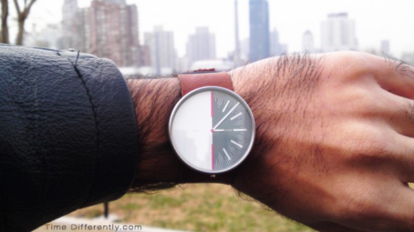
the balance watch
from time differently

The balance watch (PSFK) – a very purposeful design to remind you of work/life balance. Reminds me, working with brands and overwhelmingly with communication solutions (yet not necessarily communications challenges only), that problems are affected/caused by the environment and the problem mustn’t necessarily be attacked on the level we see it. In this case; constant visual reminder in stead of perhaps a recurring yearly, quickly forgotten, resolution.

Client/agency relationship example: how much time/focus is dedicated to how you are going to solve a challenge? How you are going to work together? The fact is that solutions can be many and very different, and the how will unquestionably vary. Many great ideas die not because of the idea itself but because the parallel discussion around the process (the purposeful design thereof) of materialising it was missing (resulting in subsequent budget/timing/execution shock).

As a matter of fact, as creative agencies have more possibilities (types of solutions), speed is crucial and complexity an increasing variable – process is going (is) to be a great competitive advantage. Perhaps even the most important one.

Categories
brand business design just a reflection marketing what is around us

brands as a part of our environment and more

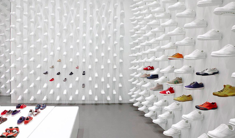
Camper is a quirky shoe brand from Mallorca, Spain. You react when you see them, from the characteristic “one-way-show-string” models, to the “rounded soldier boot meet clown shoe” inspired style but perhaps primarily their stores, in which their shoes are presented in a very artful way. It’s somewhat of an experience to browse the models which is nice.

I like the reflection below, about how Camper and its stores is part of the cities they’re in. And when you design a store, you can take cultural (and perhaps even political!) differences into account, hence looking at it from the perspective of adding, changing or commenting something that exists, in the greater context of things. In the case of Camper, using different designers to design stores around globe, resulting in drastically different experiences, it’s
“more a cultural thing”, rather than commercial, says Miguel Fluxá.

When we started to open stores outside Spain we thought it was interesting not to repeat them. The world today is becoming a little bit boring, everything is becoming the same. So we thought it was interesting for the brand, and for the cities, to do different designs from one place to the other. We started to do this many years ago and it’s something that has given us a lot of identity and has worked quite well over the years.

– Miguel Fluxá of Camper, via Dezeen

Camper in-store design
In-store design, from Dezeen.com

Categories
creativity design digital technology video clip ways of use

design as building invisibility

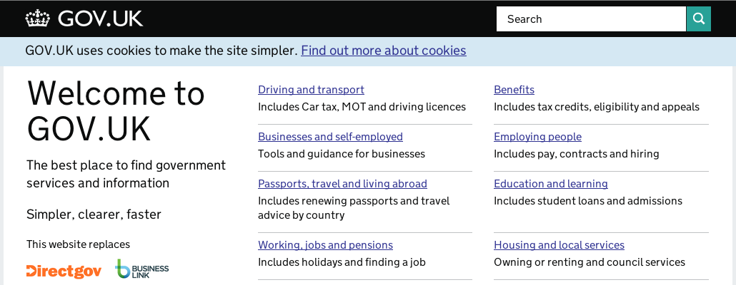
government uk screen shot

“Something we’re trying to do in particular is let design get out of the way and let the user get to what they want,” Terrett says. “You shouldn’t come to the website and go: ‘wow, look at the graphic design’. We haven’t yet achieved that in most web interfaces; they’re still getting in the way [and] you can see the graphic design everywhere. We need to get past that.”

– Ben Terrett, Government Digital Service, UK

Design is a multifaceted word/occupation/skill/mindset/purpose/tool/thing/etc. Being much about removing as much as possible, making things invisible, takes it into a very interesting place. A place where Google has been for very long, but very few brands would consider worth going. A place where many art directors would freeze to death, yet a place many artists have lived. A place where minimalism is a close relative.

“I don’t know if I want to make any strong predictions, but I hope that technology disappears more and more from my life and you forget that you’re using it all the time instead of feeling like you’re burdened [by it].”

– Alexander Chen, Google Creative Labs

Whether or not this makes you sad, it kinda indicates what you pride yourself in doing, and what design is to you. If design is making things prettier or more useful. One designer (definition 1) could design useful, human centric service, and another designer (definition 2) could make that design “pretty”. Both say they’ve done their “design duties”. Personally, working in strategy, and creativity that activates that for brands, I’m very much for being purpose driven and hence defining what you do by what happens, the outcome. Everything in-between is a means, and really quite unimportant for very long in a project. The in-betweens, for all I care, can be invisible.

“We’re trying to get design out of the way” from Dezeen on Vimeo.

Categories
design what is around us

design, design, design

Matches

Design is the bomb. Everybody talks about design. Responsive design. Designing for a digital age. Design thinking. Design thinking in customer experience. The designful company. I guess it risk becoming equally watered out/confusing (or for the initiated; finally as rich and properly defined and filled as it should) as “digital” has been for a while, having been everything from the opposite of analogue, to a mental age, to a skill-set, to a way of thinking, to a type of company, to a word used to sell yourself. Yuk.

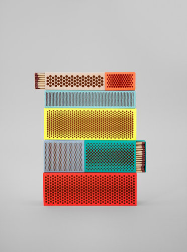
Wonderful example of seemingly undesigned or design-unworthy objects from Shane Schneck.

matches

matches again

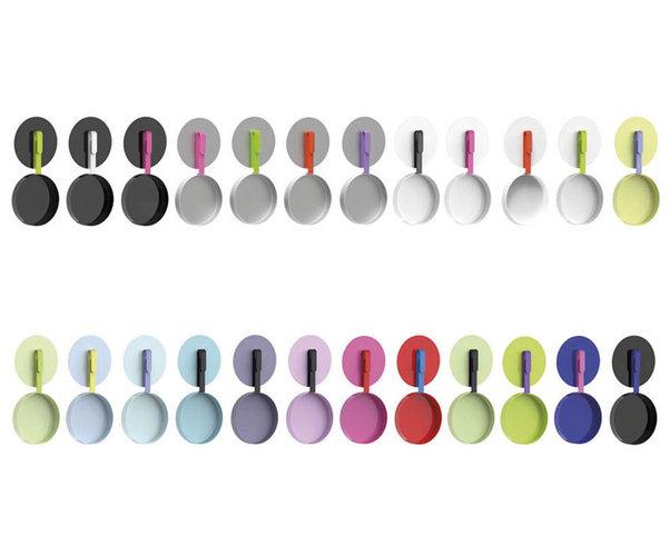
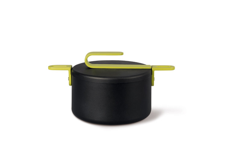
Or this stuff by Karim Rachid

pot2

Pot by karim rachid

Another Pot by Karim Rachid

Everything obviously needed more design focus than we thought. Little has been well designed enough. Design hasn’t reached the little things enough. Etcetera. Or, I’m fooled by lack of perspective and it actually was but not anymore.
Lot’s of great examples from Fast Co.Design.

Update 2016-10-09:
Artsy got in touch and let me know there’s a page dedicated to Karim Rashid, on Artsy.

Categories
brand design ways of use

Hitler and Apple

I read an article today about politics, design, symbols and the parallels to product brands and the fact that (says the author, Kim Salomon, professor of International History at the university in Lund, Sweden) the differences are minimal. Hitler was inspired by brands from the business world in general, and the German company AEG in particular.

The notion that a product alone isn’t enough, but that it has to have an identity and stand for something more, hold aspirational values, and even feel like it fits in a life style, was something Hitler understood. He also saw the importance of style and design. Regardless of how one feels about Hitler and his philosophy, he did manage to find a very strong symbol (and typeface, architecture and illustrations etc). An nice looking brand book really. Hugo Boss, apparently, had a monopoly on the black SS uniforms because there were very strong restrictions when it came to licensing the “products”…

Nazis, communist China, Fascist Italy and the soviet union were very good at brand strategies and selling their political ideas. The leaders were used on posters, houses, newspapers etc – and I have to say that Hitler, Musolini, Mao and Lenin do look strong (well, Mao doesn’t always look so strong perhaps). The mustache, the smile and the shaved head. Old Nazi posters do look powerful with the stylish, well designed and thought through (not to mention the typography). Of course, now they connote very negative feelings first and foremost.
Design does evoke feelings. In the Apple case – even people with no estethical interest can be attracted by the slick package the beautiful iPod comes in. Slick, minimalistic and high quality. In the Nazi case, I can’t help but marvel over the communication pieces, which of course was exactly the aim back then too. In that case the beautiful branding sold a crap philosophy.

Apple (oh, the never ending case study) – they understand it. Then again, they’re one of the relatively few companies, for the masses, that understand that (and act like it) a chain is only as strong as its weakest link. After the return of Jobs, and the last try (focusing on the iMac only) I think this has become really clear to them. Product quality, package, design, augmented product, marketing and services – it’s all product in the minds of the consumers and my God they understand it. And my God it works. That’s how you get and maintain a price premium, a loyal fan base and people who tattoo the brand logo on themselves