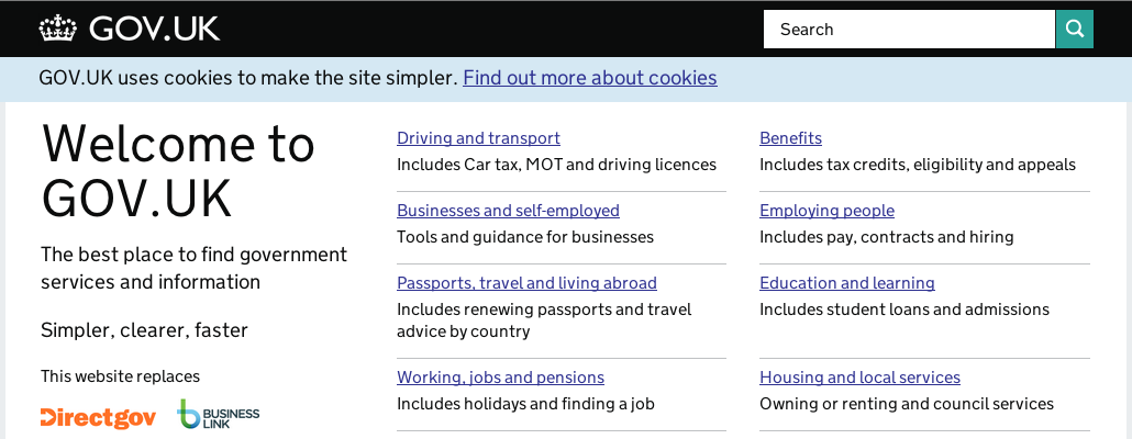
“Something we’re trying to do in particular is let design get out of the way and let the user get to what they want,” Terrett says. “You shouldn’t come to the website and go: ‘wow, look at the graphic design’. We haven’t yet achieved that in most web interfaces; they’re still getting in the way [and] you can see the graphic design everywhere. We need to get past that.”
– Ben Terrett, Government Digital Service, UK
Design is a multifaceted word/occupation/skill/mindset/purpose/tool/thing/etc. Being much about removing as much as possible, making things invisible, takes it into a very interesting place. A place where Google has been for very long, but very few brands would consider worth going. A place where many art directors would freeze to death, yet a place many artists have lived. A place where minimalism is a close relative.
“I don’t know if I want to make any strong predictions, but I hope that technology disappears more and more from my life and you forget that you’re using it all the time instead of feeling like you’re burdened [by it].”
– Alexander Chen, Google Creative Labs
Whether or not this makes you sad, it kinda indicates what you pride yourself in doing, and what design is to you. If design is making things prettier or more useful. One designer (definition 1) could design useful, human centric service, and another designer (definition 2) could make that design “pretty”. Both say they’ve done their “design duties”. Personally, working in strategy, and creativity that activates that for brands, I’m very much for being purpose driven and hence defining what you do by what happens, the outcome. Everything in-between is a means, and really quite unimportant for very long in a project. The in-betweens, for all I care, can be invisible.
“We’re trying to get design out of the way” from Dezeen on Vimeo.

